Data Analysis
© “Atlanta, Georgia, USA Downtown Skyline at Dusk stock photo” by Sean Pavone
Entertainment Visualizations
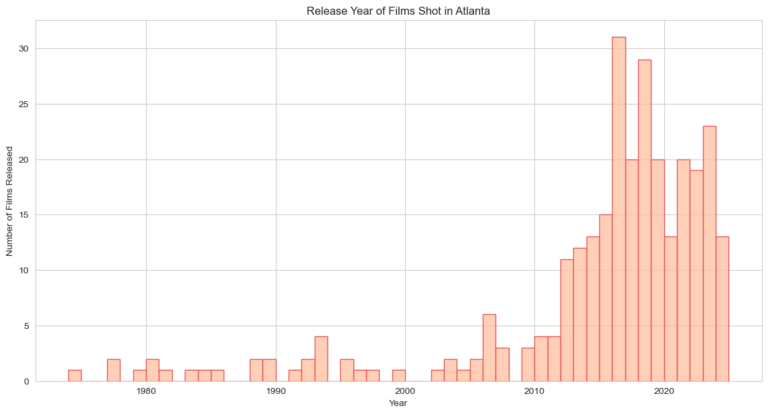
This histogram was created in Python using the Seaborn library using data that was webscraped from Wikipedia. The histogram displays the number of theatrical releases shot in Atlanta from 1974 through 2025. The noticable increase in the number of movies filmed per year demonstrates the boom in Atlanta’s popularity as a film location.
Towards the beginning of the 2010s, there was a sharp uptick in the number of films being shot in Atlanta, peaking with 31 theatrical releases in 2018. Although Georgia first passed their film tax credit bill in 2005, it took several years for the state to get the ball rolling and attract major studios. One of the most notable early productions to shoot in Atlanta was The Walking Dead in 2010, piloting with 5.6 million viewers and peaking with as many as 17 million viewers, according to the LA Times. The show’s success was a forecast of the explosion of industry the city was about to experience. Soon, filmmakers like Tyler Perry would establish themselves, building studios and attracting industry talent. Atlanta went on to become the background for some of the biggest blockbusters of the 2010s, hosting multibillion-dollar franchises like The Fast and the Furious, The Hunger Games, and much of the Marvel Cinematic Universe.
This visualization is a clear indicator of the film industry’s presence in Atlanta. As we can see, the city is now an attractive hub for major studios and smaller creators alike and sees a steady stream of theatrical releases being shot there every year.

The bar chart, visualized using Tableau, presents the trajectory of employment in “Arts, Design, Entertainment, Sports, and Media Occupations” in Georgia from 2012 to 2022, providing a clear depiction of the influence of the introduction of the film industry’s on job growth in Georgia. The chart shows an upward trend in employment, interrupted only by the noticeable dip in 2020 and 2021, which can likely be explained by the COVID-19 pandemic impact.
One of the main selling points of the tax credit policy changes that Georgia implemented was a drastic increase in jobs. They argued that the introduction of the film industry would benefit Georgian residents through creating more jobs. However, as you can see, the job landscape did increase but not proportionally to the increase in the number of films released as shown in the first chart. This small change in job availability does not outweigh the negatives the film industry brings to the locals in the city of Atlanta.
Housing Market Visualizations
The line chart, developed via Tableau, depicts the average Index NSA of the city of Atlanta Georgia from the years 1975 to 2023. The graph outlines the average change in the value of the U.S. residential housing market in the region of Atlanta over the period 1975-2023. Based on the graph, we can see that the value of the housing market has greatly increased in Atlanta over the years with only one noticeable decline in housing prices occurring around the 2008 economic recession.
Directly following this decrease in 2008, there is an exponential increase in Atlanta housing prices starting around the 2010s. This sudden increase perfectly coincides with the massive movie production boom we saw in the first graph depicting the number of films made per year in Atlanta. This similarity between the graphs leads us to believe that the growth of the film industry has a strong connection to the increase in housing prices in Atlanta. Following the introduction of the tax credit system in Georgia and subsequent boom of film production, it appears that the Atlanta housing market shot up as well.


This visualization was created using Tableau by subsetting the data to only examine areas in Georgia and calculating the average house price index by year for each metropolitan area. The line chart shows a comparison of the growth of the average house price index in 13 metropolitan areas in Georgia from 1975 to 2023. Some areas are newer than others and therefore only have data starting in later years.
When the orange line that represents the Atlanta metropolitan area is selected, we can easily see that the Atlanta metropolitan area has had the sharpest increase in net house price index compared to the other metropolitan areas. Similarly to the past visualizations we have shown, this exponential increase begins around 2010, corresponding to the boom of film production in Atlanta. This visualization shows that the housing prices in Atlanta have been driven up more than any other area in Georgia in recent years. Based on our investigation, we believe that this increase in housing prices can be attributed to the rise of the film industry in Atlanta.
Film Production vs. Housing Market
Explanation
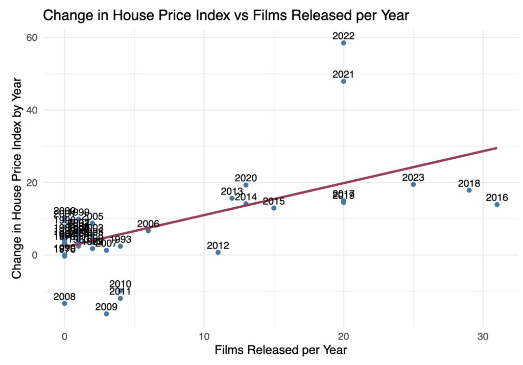
After analyzing the state of the film industry and housing market, we wanted to see if there was a relationship between the number of movies filmed in Atlanta in a given year and the corresponding rise in the House Price Index for that year. We noticed that the substantial increase of the tax credits given out by the Atlanta government aligned with the beginning of the exponential growth of the House Price Index in the city so we decided to check if there was any statistical significance to the relationship between the increase in the film count and the change in the House Price Index.
Interpretation
We created a linear model between the change in House Price Index per year and the films released per year. The model produced a p-value of 4.56e-06 which is less than the significant value of 0.05. This means that the probability of the two variables being completely unrelated and having no effect on one another is extremely unlikely. In addition, we calculated the correlation coefficient between the two variables and got 0.68. This means that the two variables have a strong positive linear correlation.
Conclusion
While we cannot claim causation due to consideration of other variables and many other factors, the data analysis and the line of best fit in the graph show us that the number of films released per year and the change in the housing price index are definitely positively related.
Community Displacement Map

Explanation
This side-by-side, interactive map, created using Tableau, illustrates the racial demographic per Atlanta zip code based on the chosen year(s). The left map depicts the number of African Americans in each zip code while the right map depicts the number of White people. Using this map, we can see how the number of black residents and white residents has changed in each zip code over the years.
Based on the maps, we can see that, in general, black residents of Atlanta tend to inhabit zip codes towards the southern limits of the city, closer to the city center. White residents tend to occupy zip codes towards the northern border, on the outskirts of the city.
Interpretation
This racial separation within the city of Atlanta perfectly reflects what we have already seen in the Mapping Inequality map. The southern neighborhoods of Atlanta were deemed “hazardous” due to the strong presence of the black community and therefore residents of these areas were generally unable to receive loans or mortgages. Areas to the north of Atlanta were regarded as “best” because of the lack of minority presence which the bank deemed as ‘financially safe’, allowing white residents of these neighborhoods to purchase property.
When set to compare the years 2011 and 2022, the maps can reveal the movement of racial groups across neighborhoods in Atlanta over the course of the decade. The blue circles represent the size of the population of the specified race in each zip code in 2011 and the red circles represent the size of the same population in 2022. When the blue circles are larger than the red circles in a zip code, this shows a decrease in the population. When the red circles are larger than the blue circles, this shows an increase in the population. Specifically, on the left map we can see that more black people have moved north towards the outskirts of the city and on the right map we can see that more white people have moved south closer to the city center and out of the suburbs.
Why could this possibly be happening?
This trend of racial displacement from 2011 to 2022 could be evidence of gentrification taking place in the city of Atlanta. As we have seen in the earlier data visualizations, this period of the 2010s was marked by a massive increase in the number of movies filmed in Atlanta which, in turn, resulted in a huge increase in the housing prices. Due to the influence of the redlining map, as illustrated by Mapping Inequality, black communities and black business owners were historically unable to purchase homes or property around the center of Atlanta, where they lived. Because of the neighborhood’s ‘hazardous’ status, they were forced to rent instead. Now, with the boom of the film industry and subsequent rise in housing prices, these black communities and black businesses can no longer afford to stay in the city and are being pushed towards the outer edges. White communities, who were able to accumulate generational wealth from the possession of property, are now taking the place of the displaced black communities in the center of Atlanta.
In Summary...
Given our analysis and findings, we see that following the boom of film production in Atlanta, there is structural evidence of gentrification in the form of surging housing prices and racial displacement.